wello
Naming | Brand Strategy | Identity Development
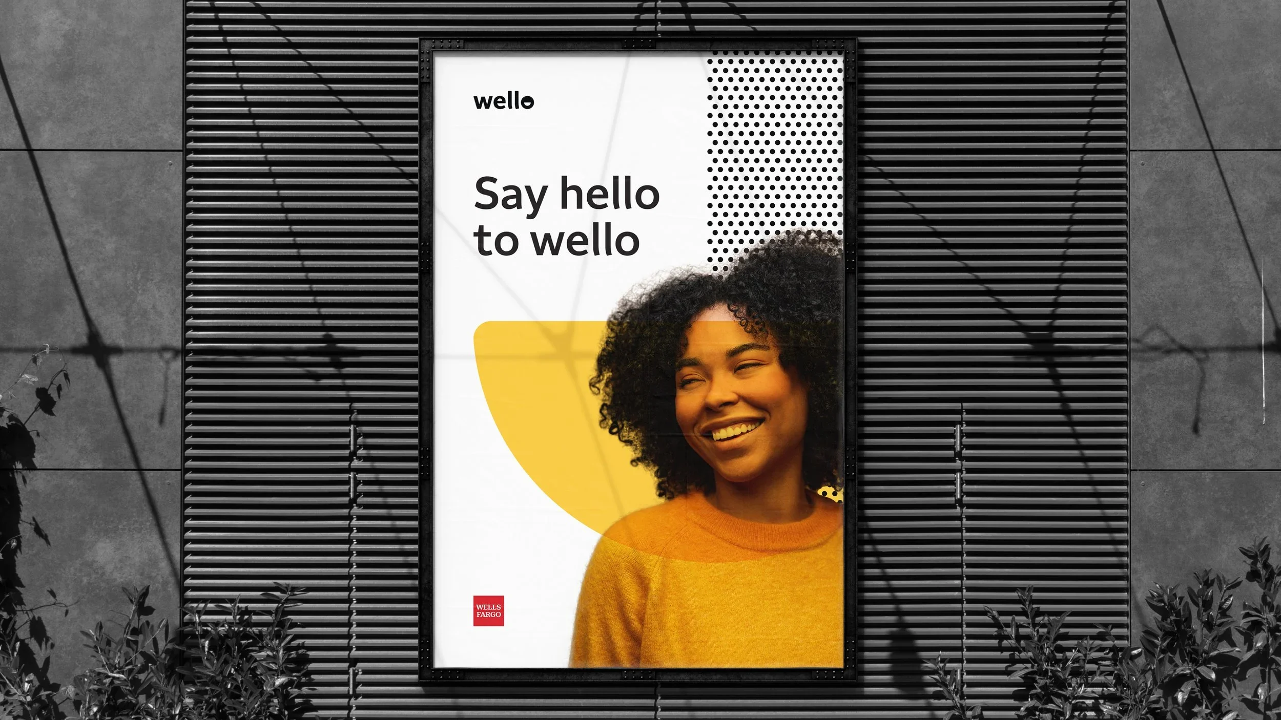
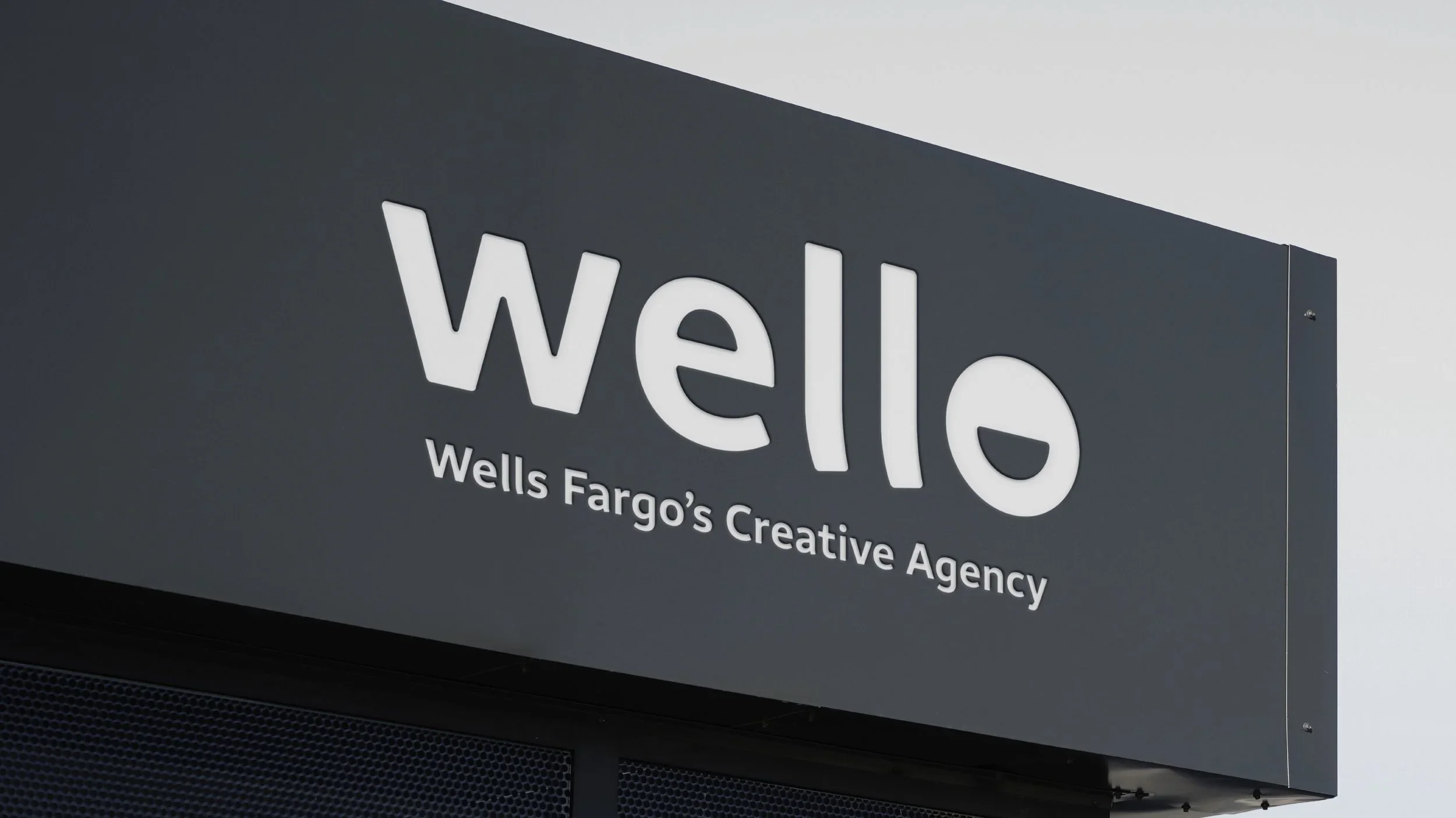


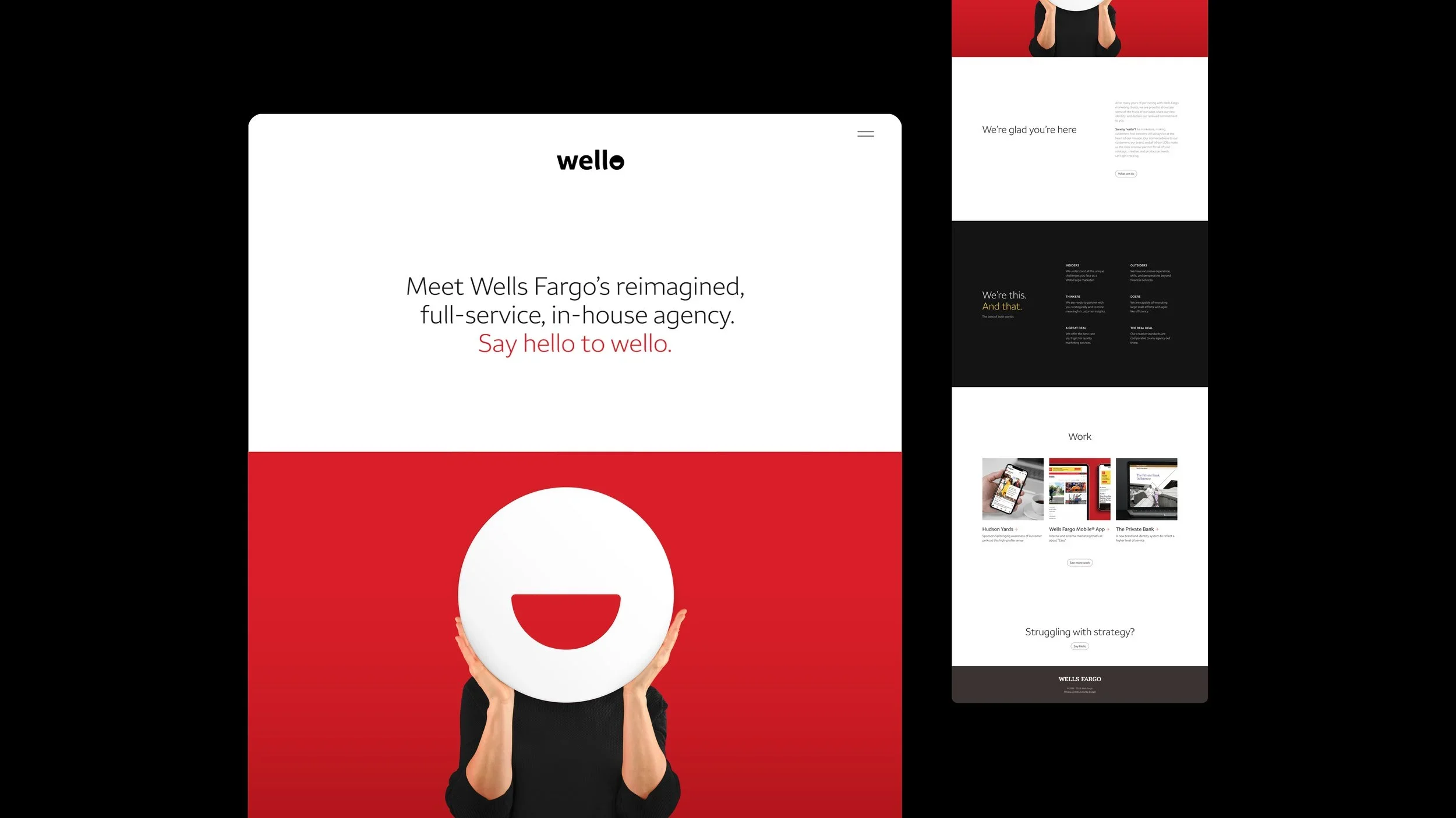
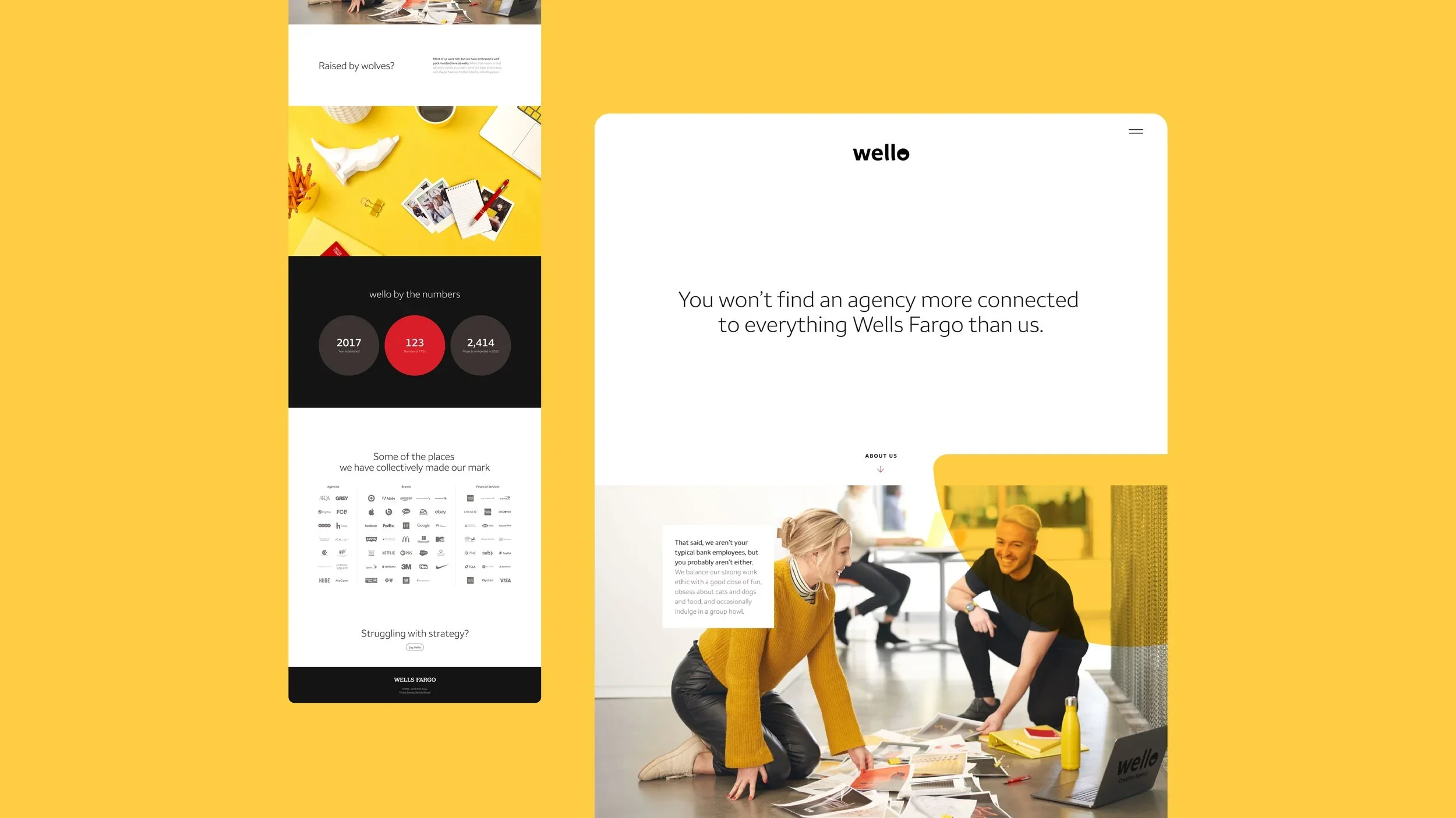
Creating a brand for Wells Fargo's in-house creative agency
As Wells Fargo's internal creative organization matured, its existing identity no longer reflected the caliber of the work, the breadth of its capabilities, or its role within the enterprise. The opportunity was to create a brand that could unite the team around a shared purpose while establishing a more distinctive and recognizable presence across the organization.
I led the naming process and helped define the strategic foundation for what would become wello. The name combines "Wells" and "hello" while also evoking the expression "well, hello," a simple idea rooted in optimism, approachability, and human connection. More importantly, it gave the agency a voice, a point of view, and a clear identity that extended beyond its functional role as an in-house team.
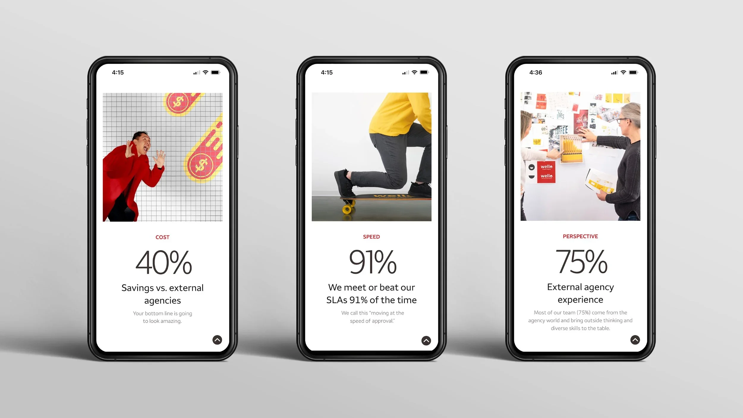
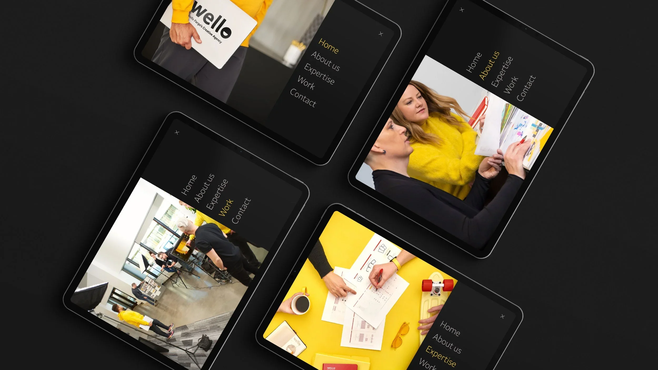
Working alongside a cross-functional creative team, we developed a flexible brand system built around bold color, dynamic form, expressive motion, and storytelling. The identity was designed to celebrate creativity while maintaining a strong connection to the Wells Fargo brand and culture.
The result was more than a rebrand. wello gave the agency a shared identity and a stronger voice within the organization. It strengthened team culture, elevated the visibility of the work, and created a brand people embraced. Its energy, optimism, and memorability helped it become a natural part of the agency's culture and presence across the enterprise.
Role
Naming, Creative Direction, Brand Strategy, Identity Development
Team
In partnership with Scott Gilson (Creative Director), Harrison Washuta (Art Direction & Logo Design), Brian Bennett (Art Direction), Tam Hoang and David Caneday (Design), Steve Scowden (Writing), Jeremy Solterbeck and Scott Gilson (Photography), and Maria Anderson (Digital Production).